In the ever-evolving world of e-readers, enthusiasts are always on the lookout for the next big thing that will enhance their reading experience. I recently had the opportunity to compare two popular color e-readers: the Pocketbook Verse Pro Color and the Kobo Libra Colour. What initially seemed like a straightforward comparison turned out to be quite surprising, especially in terms of color performance.
Both the Pocketbook Verse Pro Color and the Kobo Libra Colour utilize the same color e-ink technology, known as Kaleido 3, which promises vibrant colors and crisp text. Kaleido 3 is renowned for its ability to bring a splash of color to e-ink screens, which traditionally display only black and white.
See the video:
Better Colors on the Pocketbook Verse Pro Color
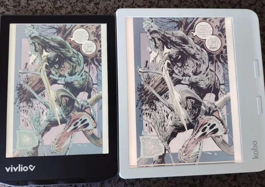
During my side-by-side comparison, I was taken aback by the noticeable difference in color vibrancy between the two devices.
The Pocketbook Verse Pro Color consistently displayed richer and more vivid colors compared to the Kobo Libra Colour.
Reds were deeper, blues were more striking, and overall, images and graphics seemed to pop off the screen with greater intensity.
Why the Difference?
The primary reason this difference is so surprising is that both e-readers are utilizing the same Kaleido 3 technology.
It begs the question: if the underlying technology is identical, why is there such a disparity in color performance?
Several factors could contribute to this phenomenon:
-
Screen Calibration: The Pocketbook Verse Pro Color might have a superior screen calibration process, ensuring that colors are displayed more accurately and vividly.
-
Software Optimization: The device's software can significantly impact how colors are rendered. It's possible that Pocketbook has optimized its software to take full advantage of the Kaleido 3 technology.
-
Light Settings: Variations in front light technology and settings between the devices might also play a role in how colors are perceived.
Conclusion
The disparity in color performance between the Pocketbook Verse Pro Color and the Kobo Libra Colour, despite both using the same Kaleido 3 technology, is intriguing.
It highlights how even identical tech can yield different results based on factors such as screen calibration, software optimization, and build quality.
For potential buyers, this serves as a reminder to look beyond specs and consider hands-on reviews and comparisons to find the device that best suits their needs.
If vivid color reproduction is a key factor in your decision-making process, based on my comparison, the Pocketbook Verse Pro Color may be the superior choice. However, both devices offer excellent features and it's always worth considering other aspects such as user interface, ecosystem, and price before making your final decision.
If you liked this article, consider sharing this page on social network or to someone that could benefit from the information.